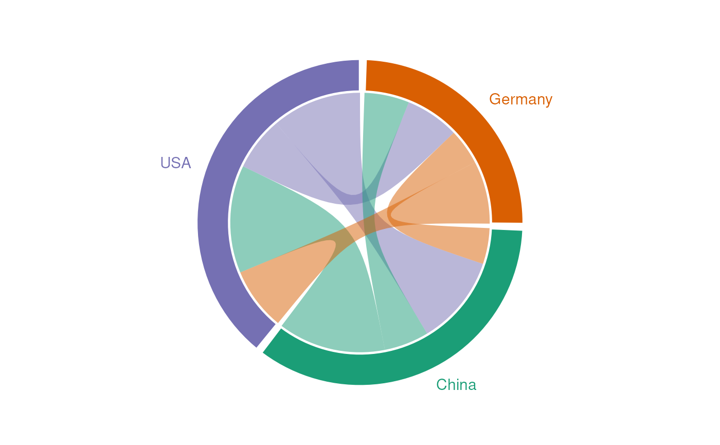
Introduction to ggchord2
ggchord2.RmdSimple chord diagram
trade <- data.frame(
  source = c("USA", "USA", "China", "China", "Germany", "Germany"),
  target = c("China", "Germany", "USA", "Germany", "USA", "China"),
  freq   = c(50, 30, 60, 25, 35, 20)
)

ggplot(
  data = trade,
  mapping = aes(
    source = source,
    target = target,
    freq = freq
  )
) +
  geom_chord_diagram()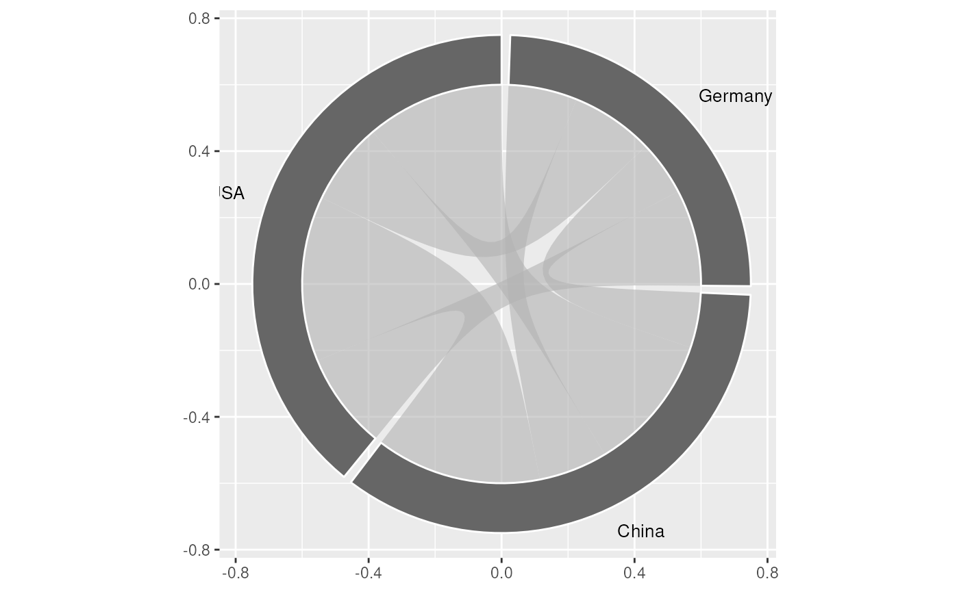
Colour by source node:
ggplot(
  data = trade,
  mapping = aes(
    source = source,
    target = target,
    freq = freq,
    fill = source
  )
) +
  geom_chord_diagram()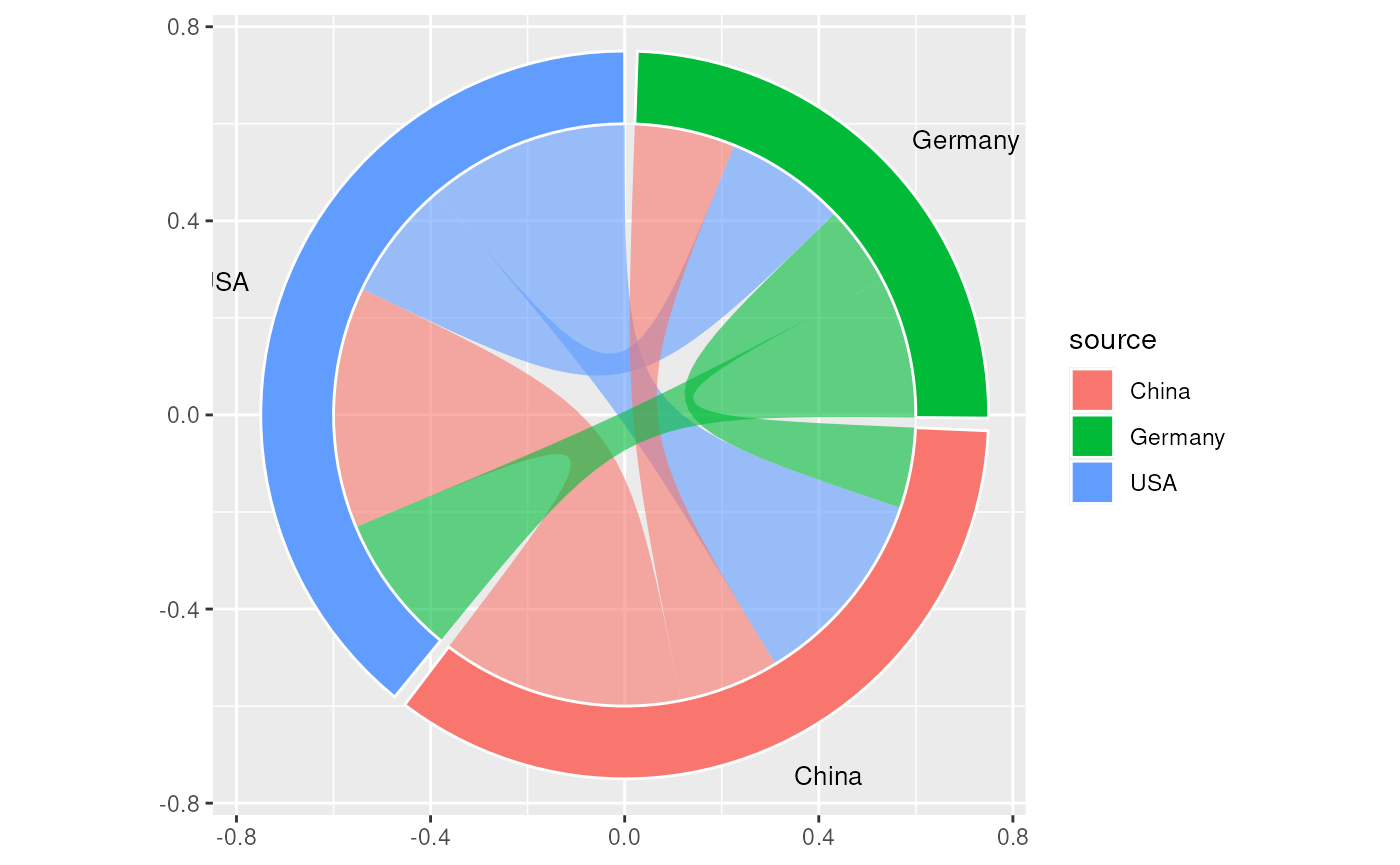
You’ll notice that some of the longer category labels may become
cropped. This is a result of the way that the underlying
geom_text() functions in ggplot2 work. See the
vignette
on positioning text for several different solutions.
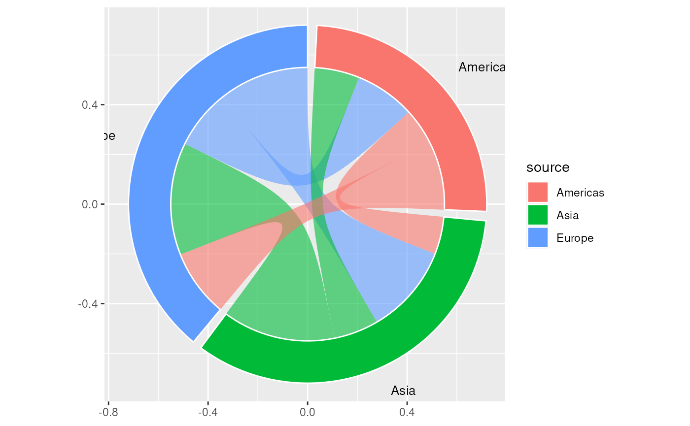
Asymmetric flows
flows <- data.frame(
  source = c("Europe", "Europe", "Asia", "Asia", "Americas", "Americas"),
  target = c("Asia", "Americas", "Europe", "Americas", "Europe", "Asia"),
  freq   = c(12, 8, 15, 6, 9, 5)
)

ggplot(
  data = flows,
  mapping = aes(
    source = source,
    target = target,
    freq = freq,
    fill = source
  )
) +
  geom_chord_diagram(
    gap_degree   = 3,
    inner_radius = 0.55,
    outer_radius = 0.72
  )
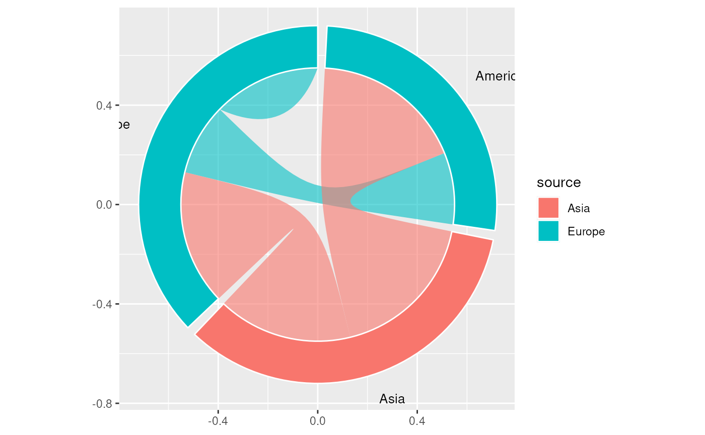
Including flows from a source into itself:
flows <- data.frame(
  source = c("Europe", "Europe", "Asia", "Asia"),
  target = c("Europe", "Americas", "Europe", "Americas"),
  freq   = c(12, 8, 15, 17)
)

ggplot(
  data = flows,
  mapping = aes(
    source = source,
    target = target,
    freq = freq,
    fill = source
  )
) +
  geom_chord_diagram(
    gap_degree   = 3,
    inner_radius = 0.55,
    outer_radius = 0.72
  )
Faceting
Faceting works as you would expect. For example, to facet by year:
trade_ts <- rbind(
  cbind(trade, year = 2022),
  data.frame(
    source = c("USA", "China", "Germany"),
    target = c("China", "USA", "USA"),
    freq   = c(65, 70, 40),
    year   = 2023
  )
)

ggplot(
  data = trade_ts,
  mapping = aes(
    source = source,
    target = target,
    freq = freq,
    fill = source
  )
) +
  geom_chord_diagram() +
  facet_wrap(~year)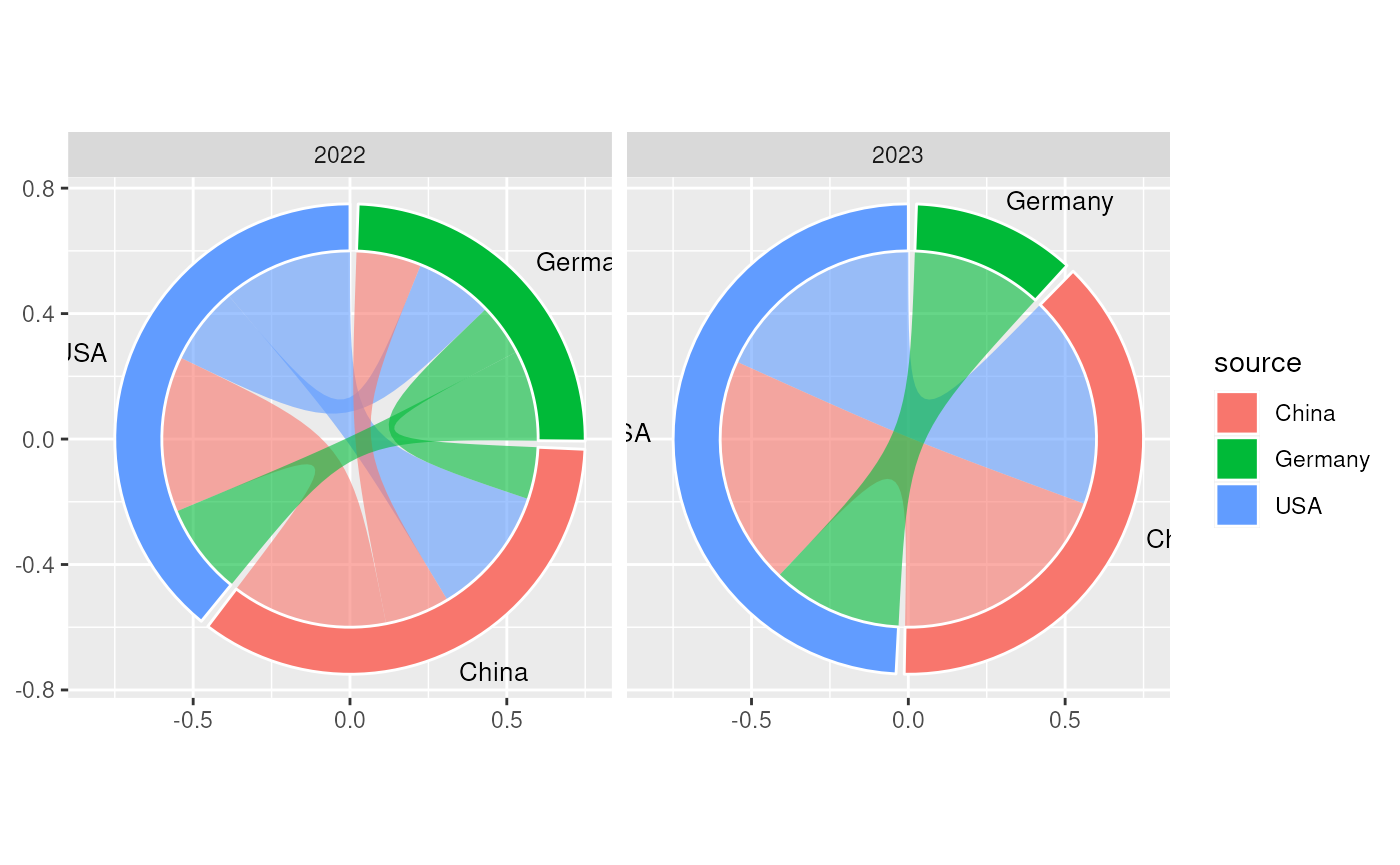
Individual layers for more control
g <- ggplot(
  data = trade,
  mapping = aes(
    source = source,
    target = target,
    freq = freq
  )
) +
  geom_chord_arcs(
    mapping = aes(fill = source),
    alpha = 0.5
  ) +
  geom_chord_sectors(
    mapping = aes(fill = source),
    colour = "white",
    linewidth = 0.8
  ) +
  geom_chord_labels(
    mapping = aes(colour = source),
    size = 4
  )
g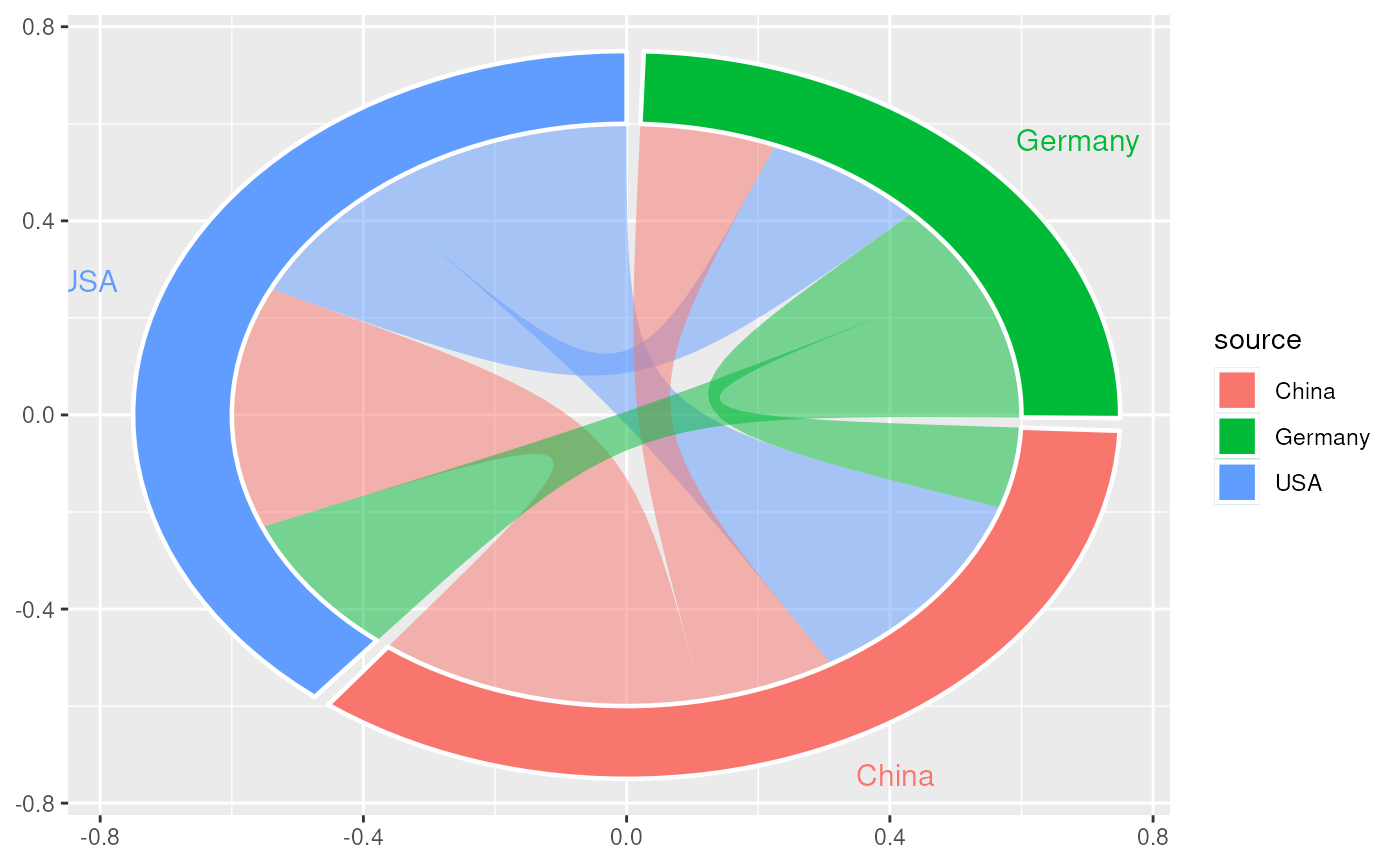
Add ggplot2 styling:
g +
  scale_x_continuous(limits = c(-1.5, 1.5)) +
  scale_colour_brewer(palette = "Dark2") +
  scale_fill_brewer(palette = "Dark2") +
  coord_fixed() +
  theme_void() +
  theme(legend.position = "none")