Positioning labels
Positioning-labels.RmdSet up some data:
set.seed(123)
n <- 15
flows <- expand.grid(
  source = 1:n,
  target = 1:n
) |>
  filter(source < target) |>
  mutate(
    source = paste0("Category ", LETTERS[source]),
    target = paste0("Category ", LETTERS[target]),
    freq = rpois(((n^2 - n) / 2), 4)
  )
Create a basic chord diagram without labels:
g <- ggplot(
  data = flows,
  mapping = aes(
    source = source,
    target = target,
    freq = freq
  )
) +
  geom_chord_arcs(
    mapping = aes(fill = source),
    alpha = 0.5
  ) +
  geom_chord_sectors(
    mapping = aes(fill = source),
    colour = "white",
    linewidth = 0.8
  ) +
  coord_fixed() +
  theme_void() +
  theme(legend.position = "none")
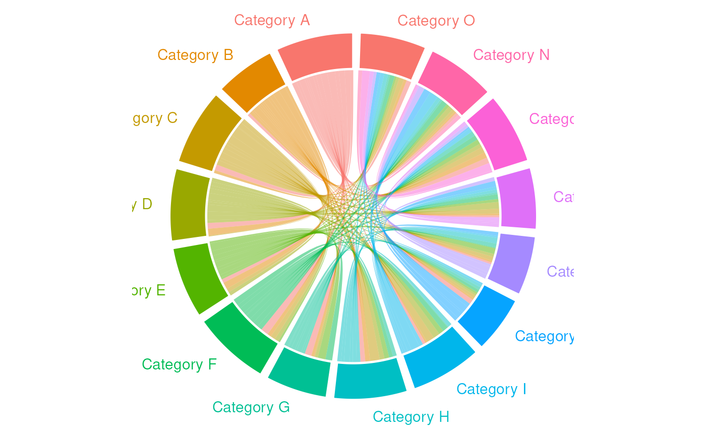
If you have many segments, there may not be enough space for the
labels using the default geom_chord_labels() function.
g +
  geom_chord_labels(
    mapping = aes(colour = source),
    size = 4
  )
A simple approach is to increase the limits of the x axis. The
default is that the chord diagram is on a circle centred at
[0, 0] with radius 1.
g +
  geom_chord_labels(
    mapping = aes(colour = source),
    size = 4
  ) +
  scale_x_continuous(limits = c(-1.5, 1.5))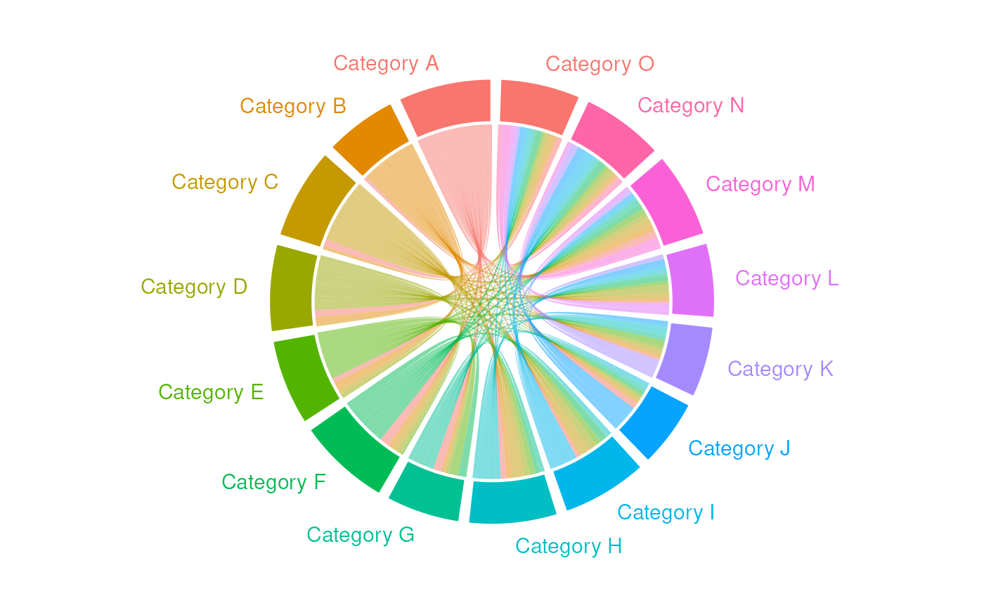
You can use perpendicular labels instead. Again, you may need to adjust the x and y limits to fit all the labels in:
g +
  geom_chord_labels_perp(
    mapping = aes(colour = source),
    size = 4
  ) +
  scale_x_continuous(limits = c(-1.5, 1.5)) +
  scale_y_continuous(limits = c(-1.5, 1.5))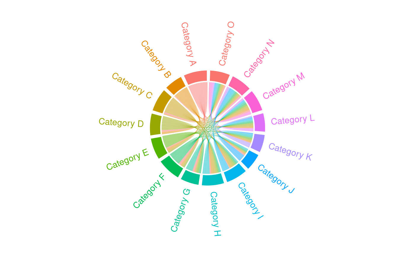
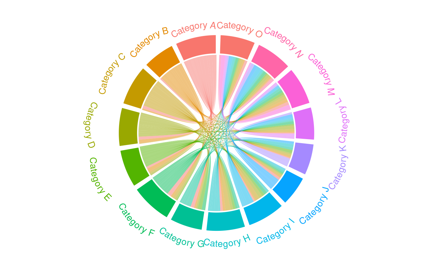
You can also use curved labels through geomtextpath:
g +
  geom_chord_labels_curve(
    mapping = aes(colour = source),
    size = 4
  ) +
  scale_x_continuous(limits = c(-1.5, 1.5))