ocean_temperature <- readr::read_csv("https://raw.githubusercontent.com/rfordatascience/tidytuesday/main/data/2026/2026-03-31/ocean_temperature.csv")
ocean_temperature_deployments <- readr::read_csv("https://raw.githubusercontent.com/rfordatascience/tidytuesday/main/data/2026/2026-03-31/ocean_temperature_deployments.csv")Visualising uncertainty
Data
For this exercise, we’ll use data on coastal ocean temperatures by depth. The dataset was used as a TidyTuesday dataset so you can load it in directly from GitHub.
NoteDownload data
Alternatively, you can download the CSV files:
Download
ocean_temperatureCSV: ocean_temperature.csvDownload
ocean_temperature_deploymentsCSV: ocean_temperature_deployments.csv
Load the data from your local copy:
ocean_temperature <- readr::read_csv("../data/ocean_temperature.csv")
ocean_temperature_deployments <- readr::read_csv("../data/ocean_temperature_deployments.csv")
For more information on the datasets, look at the data dictionaries.
Tip
You can copy the code to load the data on your laptop, and use your own R installation.
Or, you can go to nrennie.gitlab.io/dl4sg-uncertainty/code.html where you’ll find a live R environment with packages and data pre-installed.
Examples
TipUncertainty over time with
geom_ribbon()
plot_data <- readr::read_csv("../slides/data/linechart_3_data.csv")# A tibble: 6 × 5
Year Ethnicity Estimate Upper Lower
<dbl> <chr> <dbl> <dbl> <dbl>
1 2012 Asian or Asian British 4 6.8 1.1
2 2012 Black, African, Caribbean or Black British 5.6 9.3 1.8
3 2012 Mixed or Multiple ethnic groups 1.6 10.5 -8.2
4 2012 Other ethnic group 6.7 13.4 -0.7
5 2013 Asian or Asian British 4.7 8.3 0.9
6 2013 Black, African, Caribbean or Black British 2.1 6.2 -2.3library(ggplot2)
ggplot(
data = plot_data,
) +
geom_ribbon(
mapping = aes(x = Year, ymin = Lower, ymax = Upper, fill = Ethnicity),
alpha = 0.3
) +
geom_line(
data = plot_data,
mapping = aes(x = Year, y = Estimate, colour = Ethnicity),
linewidth = 1.5
) +
scale_x_continuous(breaks = seq(2012, 2022, 2)) +
labs(x = NULL) +
theme_minimal() 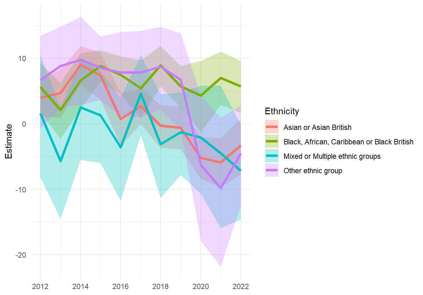
TipUncertainty in categorical estimates with
geom_rect()
bar_data <- readr::read_csv("../slides/data/bar_chart_data.csv") |>
  dplyr::mutate(
    Category = factor(Category, levels = Category)
  ) |>
  dplyr::mutate(Category_num = as.numeric(factor(Category)))
# A tibble: 4 × 5
Category Estimate Lower Upper Category_num
<fct> <dbl> <dbl> <dbl> <dbl>
1 Degree or equivalent 16 14 18 1
2 Below degree level 12 10 14 2
3 Other qualification 10 5 15 3
4 No qualification 10 5 15 4ggplot(data = bar_data) +
geom_rect(
mapping = aes(
xmin = Lower, xmax = Upper,
ymin = Category_num - 0.2, ymax = Category_num + 0.2
),
fill = "deepskyblue4",
alpha = 0.6
) +
geom_point(
mapping = aes(
x = Estimate,
y = Category_num
),
pch = 23,
fill = "white",
colour = "deepskyblue4",
size = 8
) +
scale_y_continuous(
breaks = unique(plot_data$Category_num),
labels = levels(factor(plot_data$Category))
) +
labs(y = NULL) +
theme_minimal()Warning: Unknown or uninitialised column: `Category_num`.Warning: Unknown or uninitialised column: `Category`.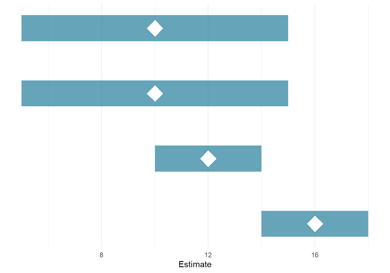
Exercise 1
Below is some R code to load and process some data:
library(ggplot2)
library(dplyr)
library(lubridate)
plot_data <- ocean_temperature |>
  filter(
    year(date) >= 2023, year(date) <= 2025,
    sensor_depth_at_low_tide_m %in% c(2, 5, 10)
  ) |>
  mutate(sensor_depth_factor = factor(sensor_depth_at_low_tide_m)) |>
  # compute CI
  mutate(
    lower = mean_temperature_degree_c - qnorm(0.975) * (sd_temperature_degree_c / sqrt(n_obs)),
    upper = mean_temperature_degree_c + qnorm(0.975) * (sd_temperature_degree_c / sqrt(n_obs))
  )
Then create a default line chart:
g <- ggplot(
  data = plot_data,
  mapping = aes(
    x = date, y = mean_temperature_degree_c,
    colour = sensor_depth_factor
  )
) +
  geom_line()
g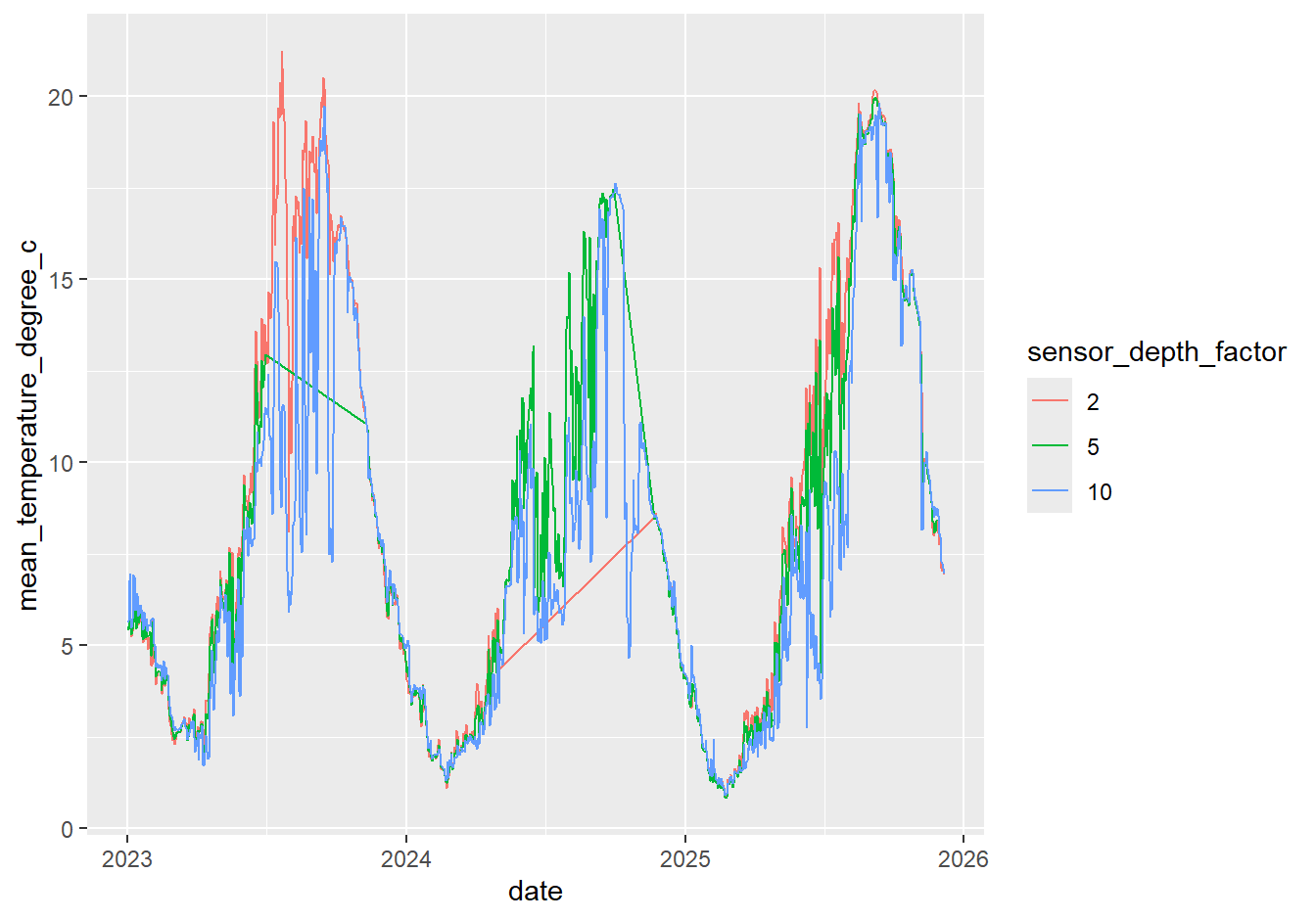
Inspect the data. You will see additional columns containing different levels of confidence intervals for different estimates in the data.
Decide if, and how, the uncertainty could be presented.
Edit the code to show uncertainty on the chart.
Hint: you may find
geom_ribbon()inggplot2useful.
Exercise 2
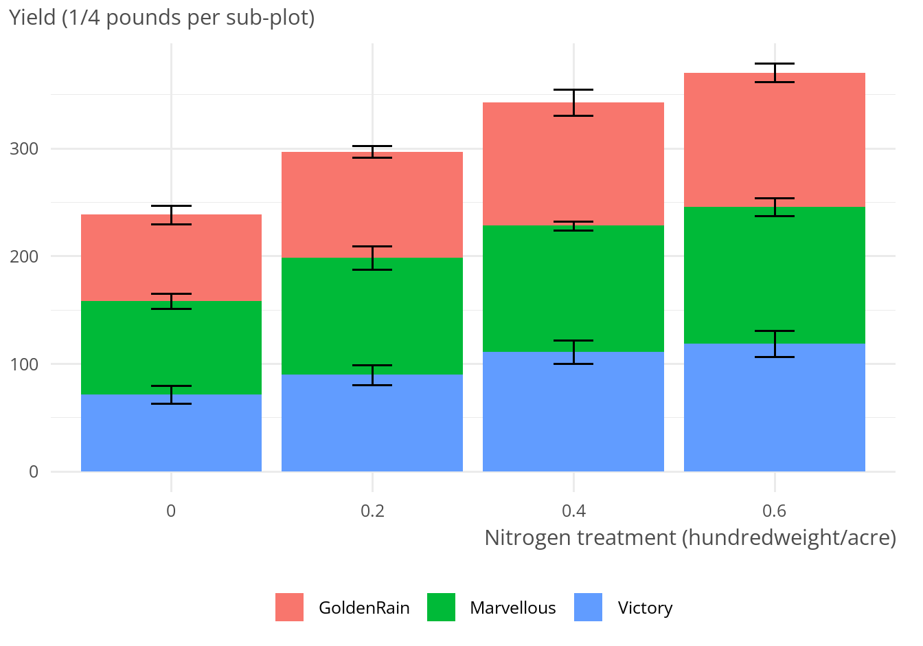
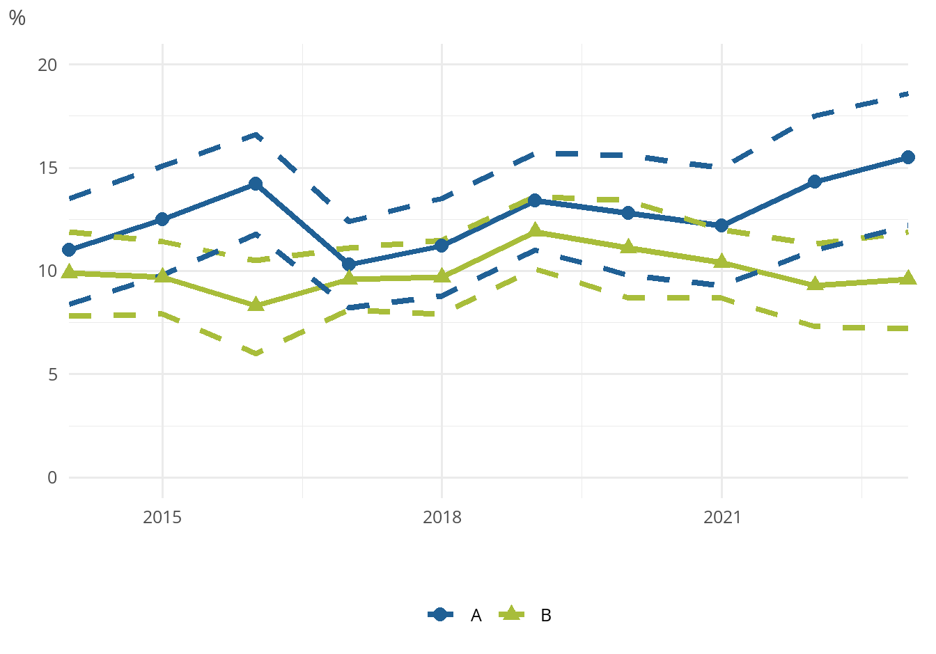
Here are two charts. In groups, discuss:
- What is good and bad about each of them?
- How would you visualise this data?