Visualising uncertainty
When and how to show uncertainty in charts
About me
Data visualisation specialist developing charts, standards, and training.
Background in statistics, operational research, data science consultancy, and academia.
Author of several R packages (mainly for visualisation).
Co-author of Royal Statistical Society’s Best Practices for Data Visualisation guidance.
What’s the conclusion from this chart?
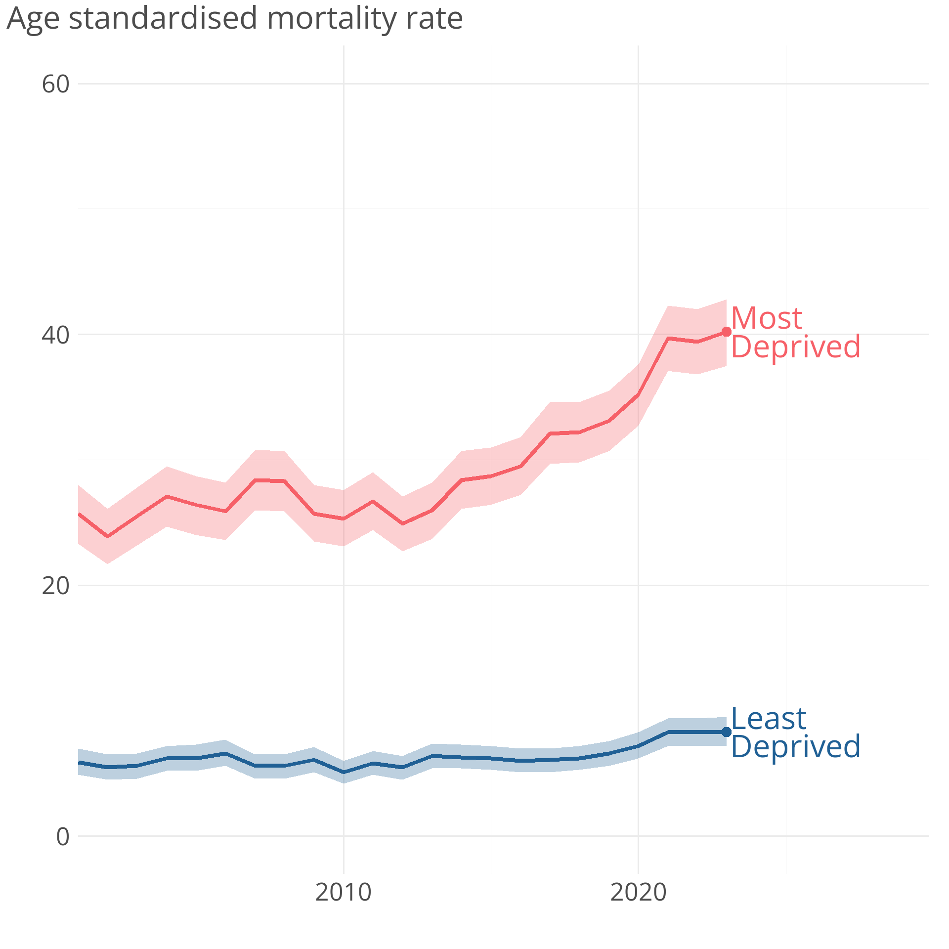
What’s the conclusion from this chart?
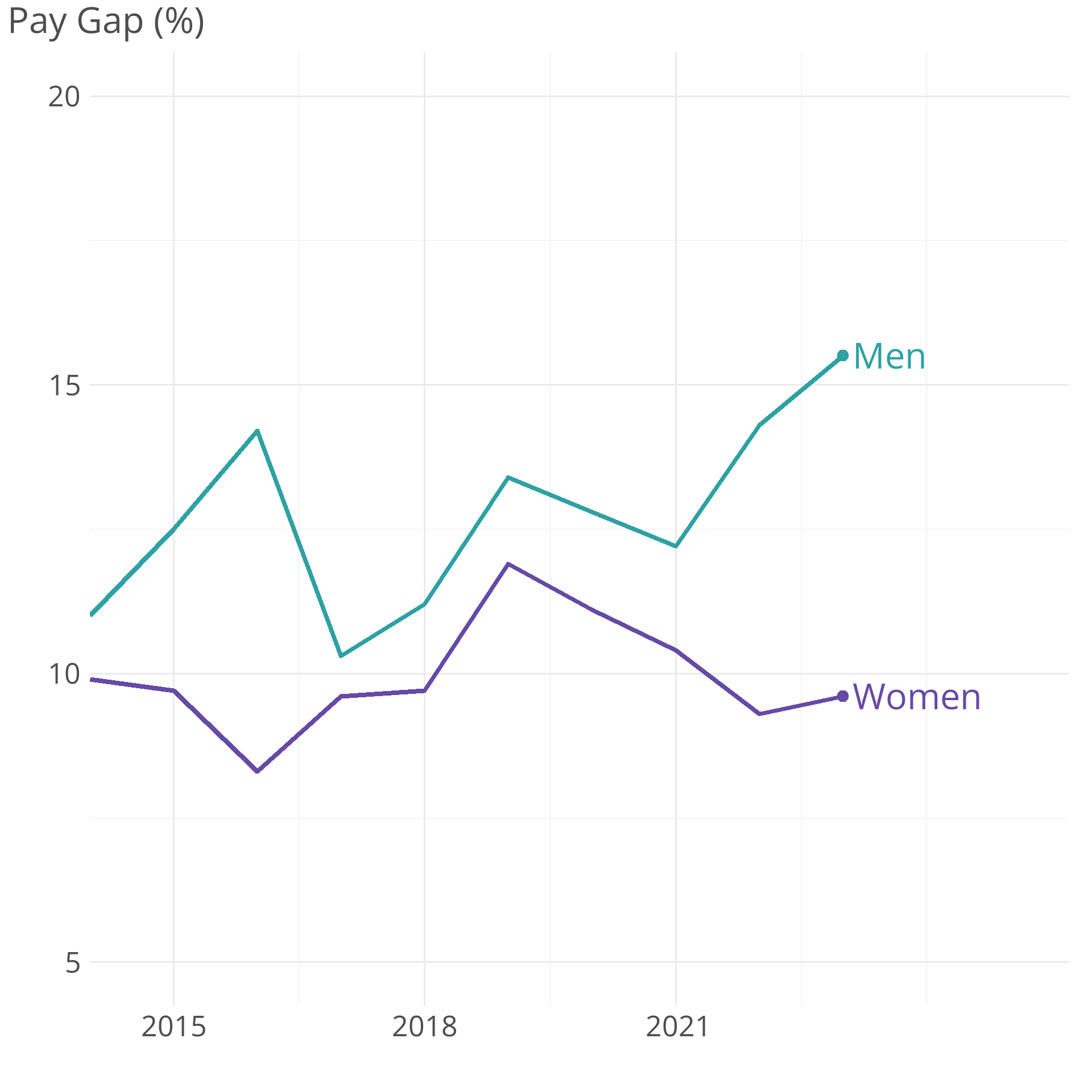
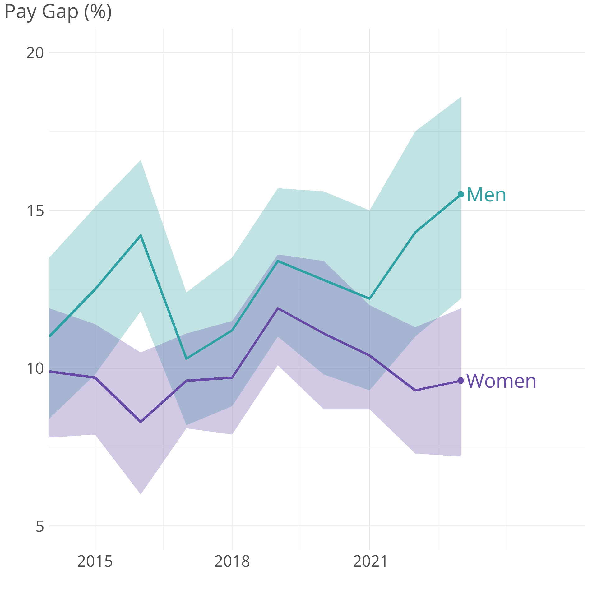
Showing uncertainty in categorical data
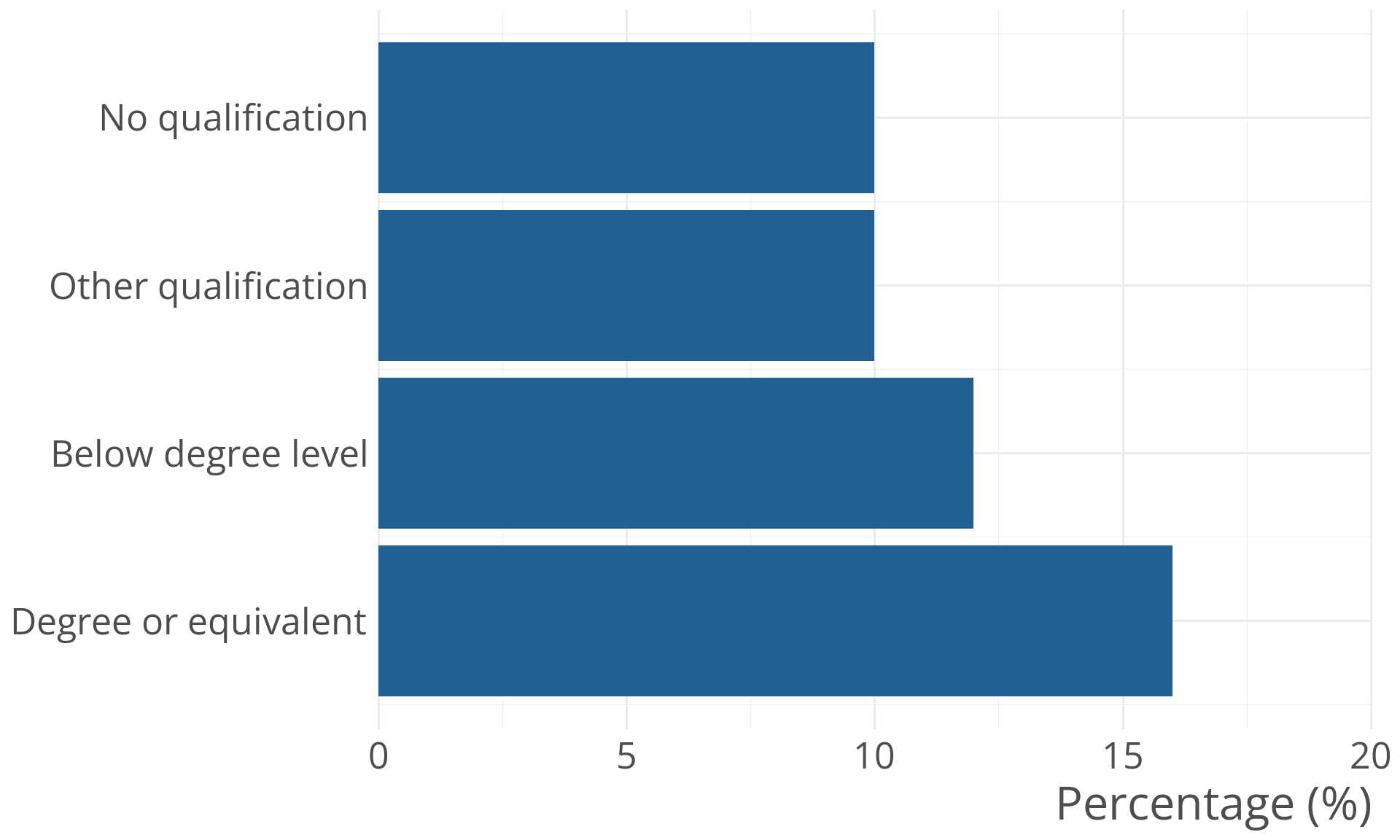
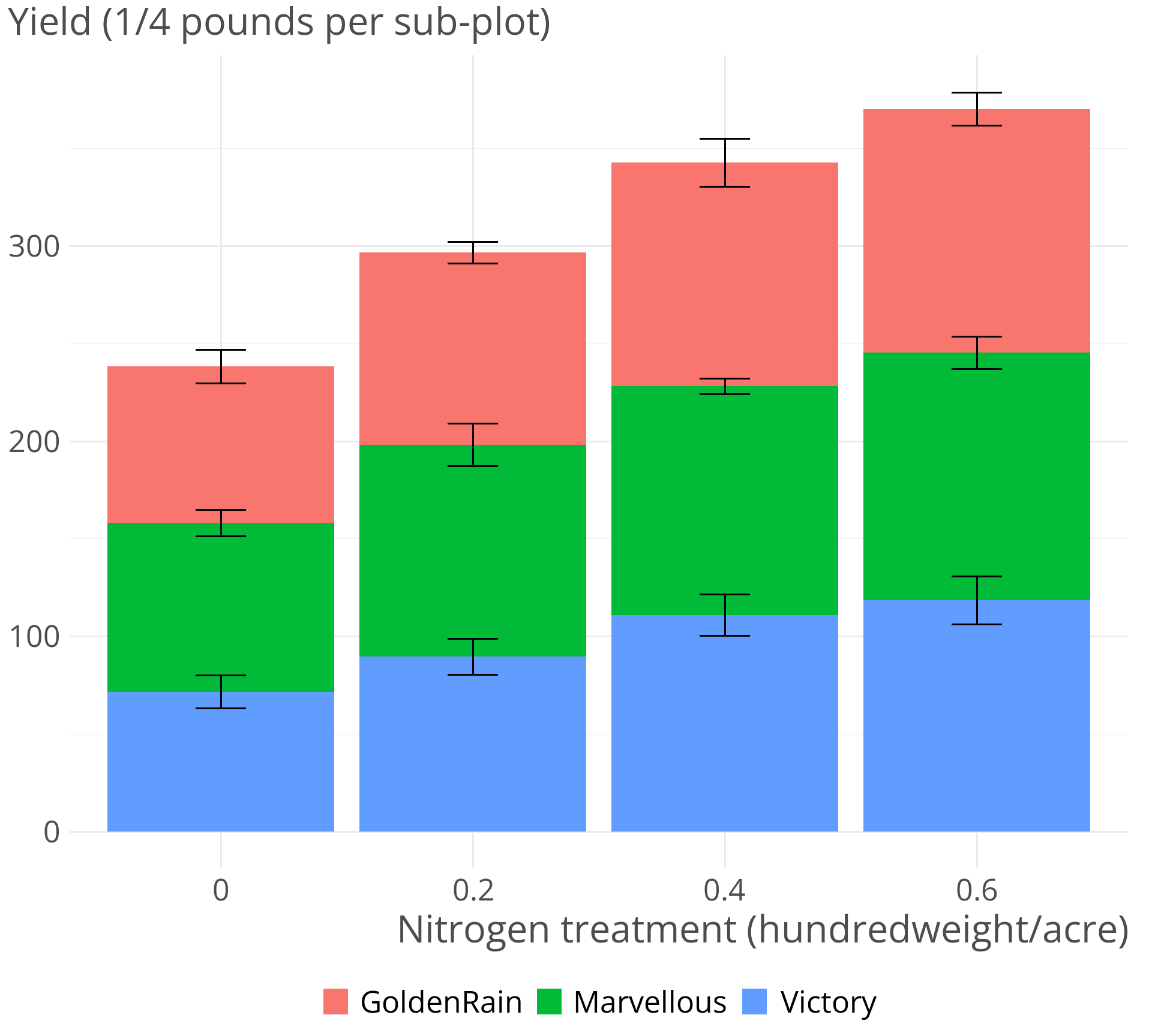
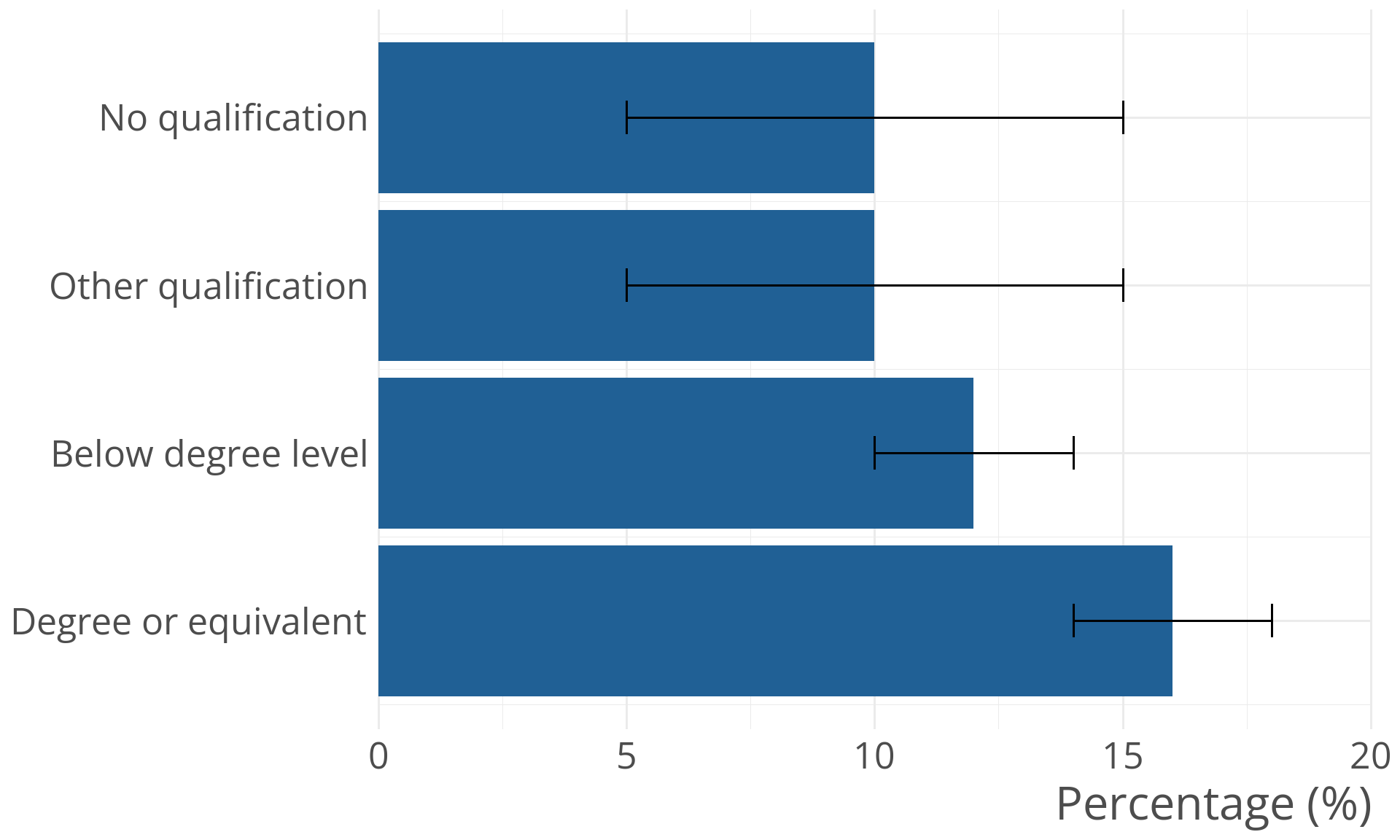
Bad: bars with errorbars
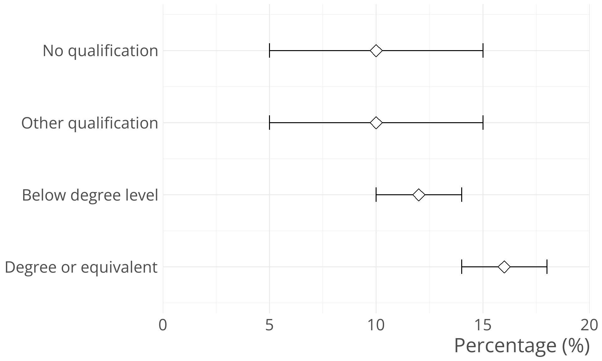
Better: errorbars with point
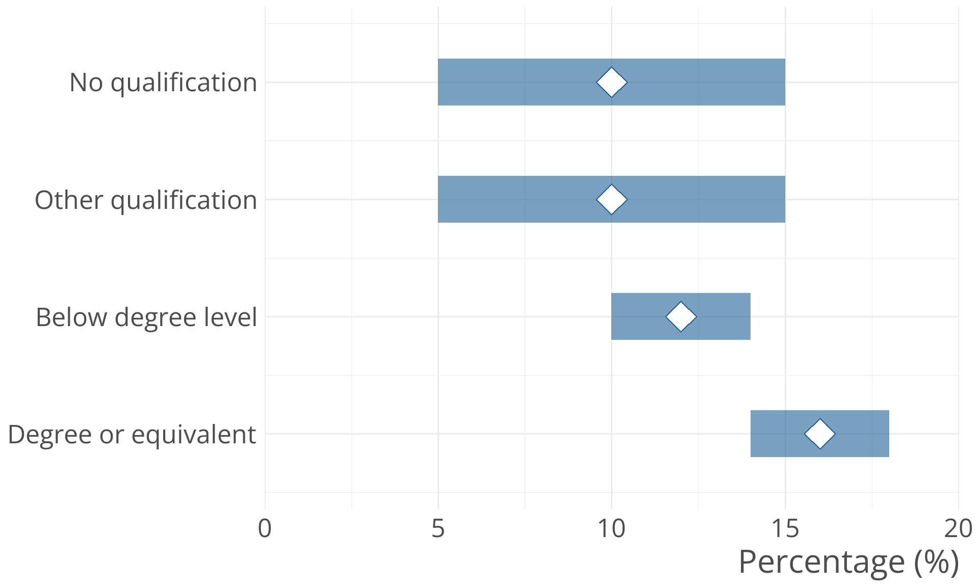
Even better: Shaded areas with points
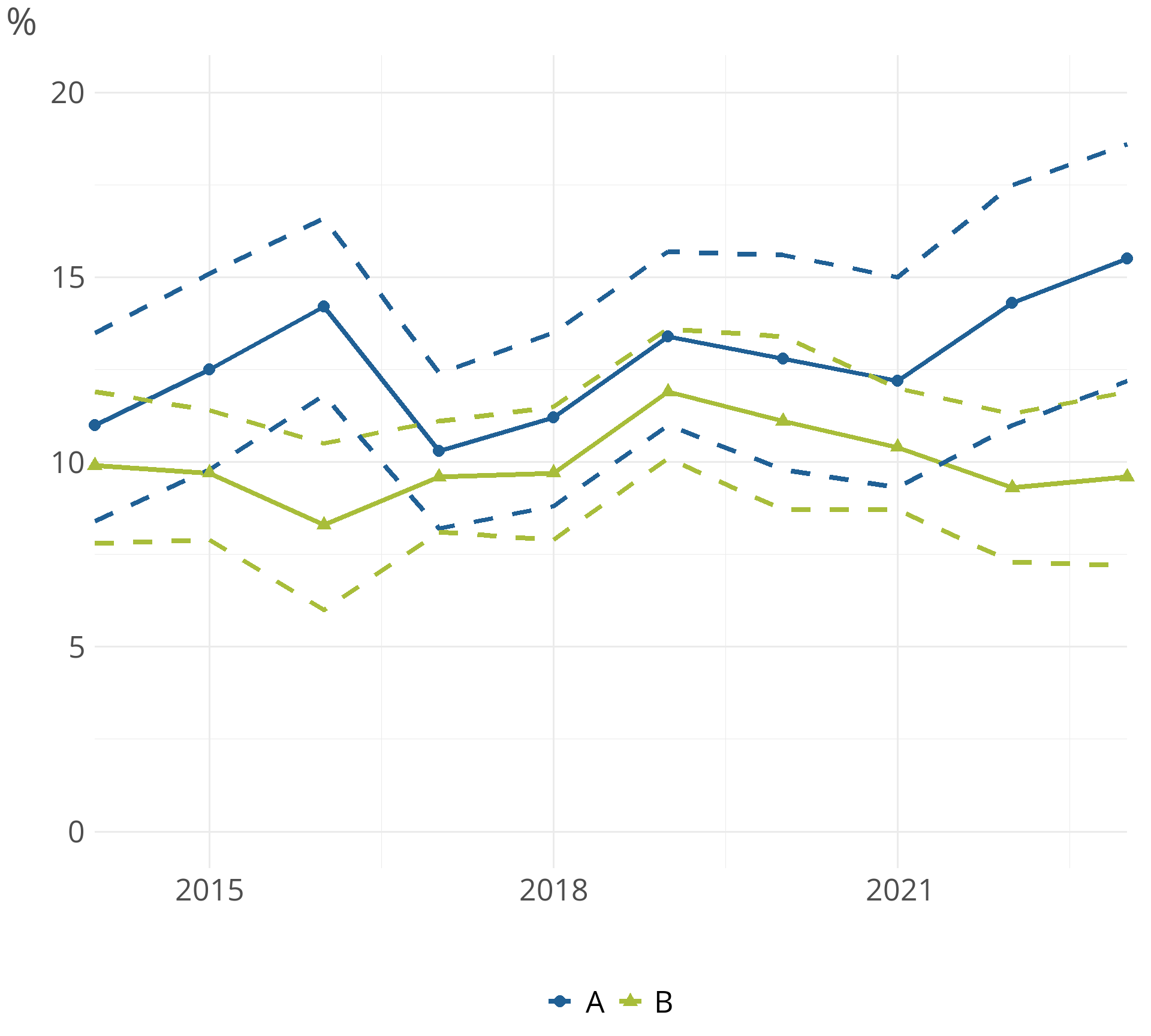
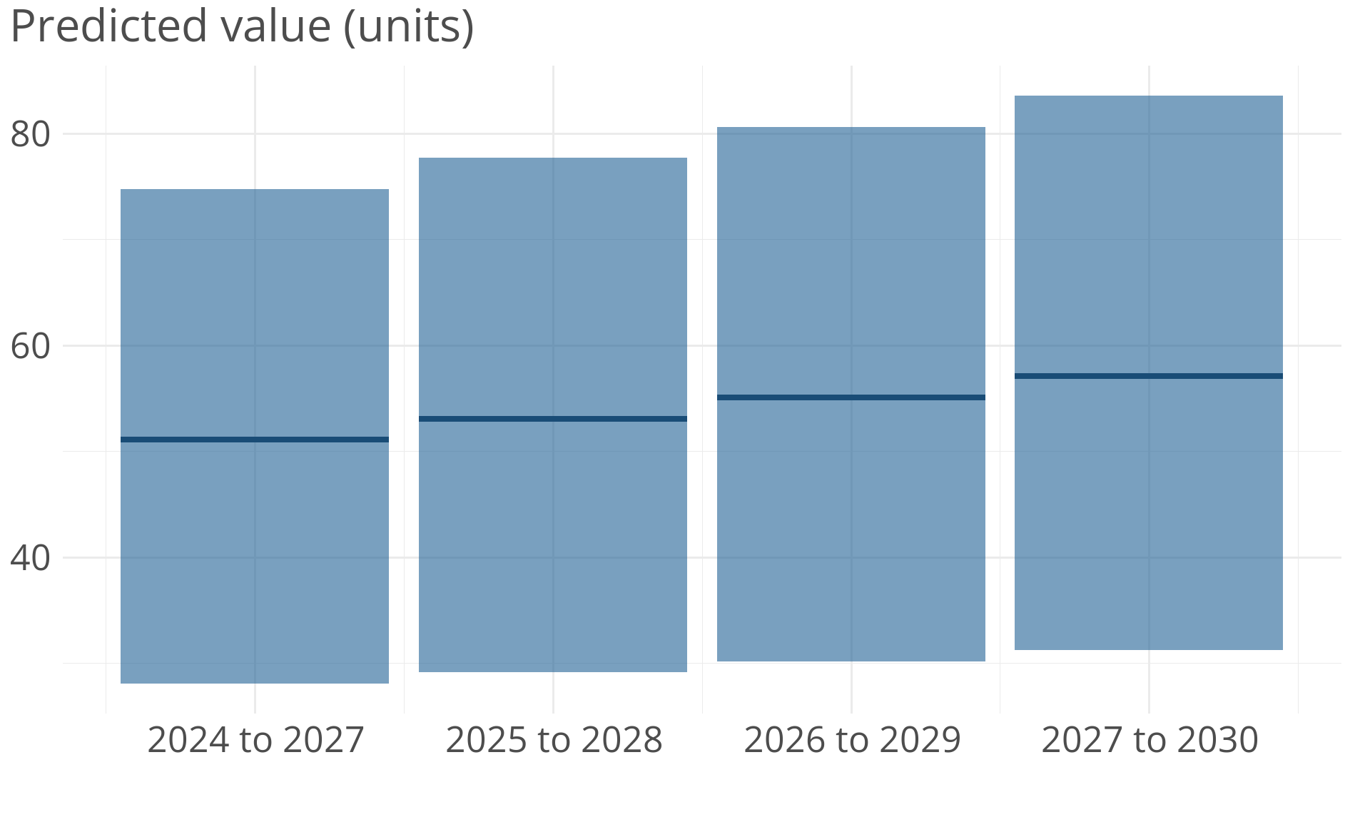
Uncertainty over discrete time periods
Uncertainty over continuous time
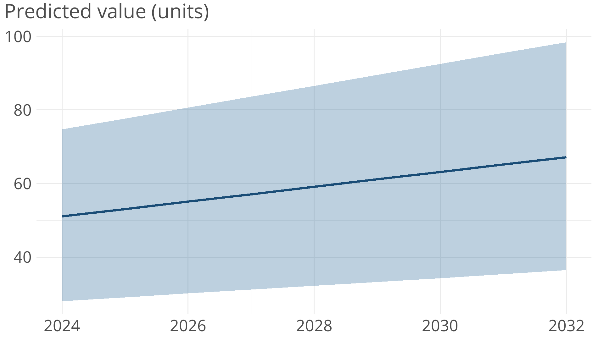
Uncertainty over continuous time
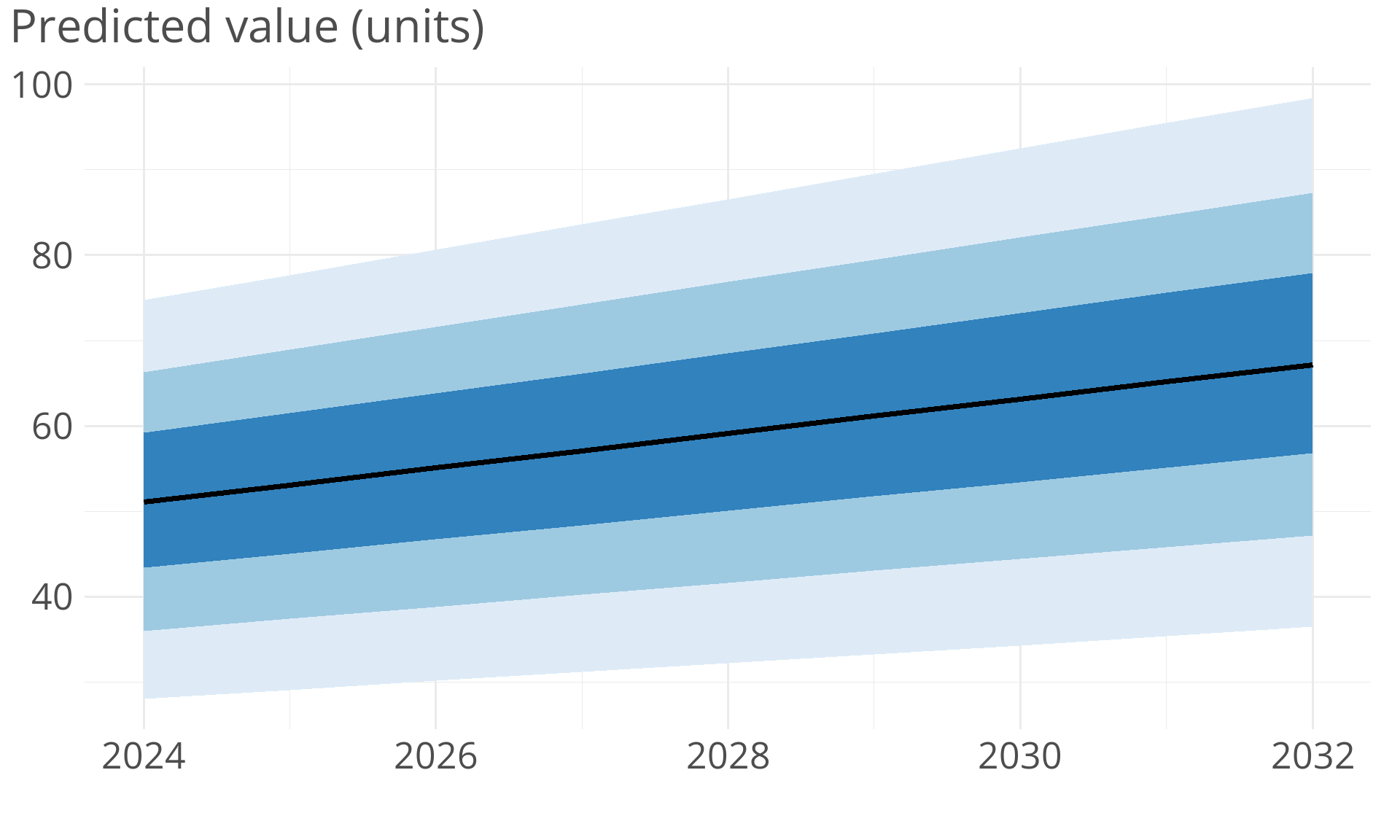
Uncertainty over continuous time
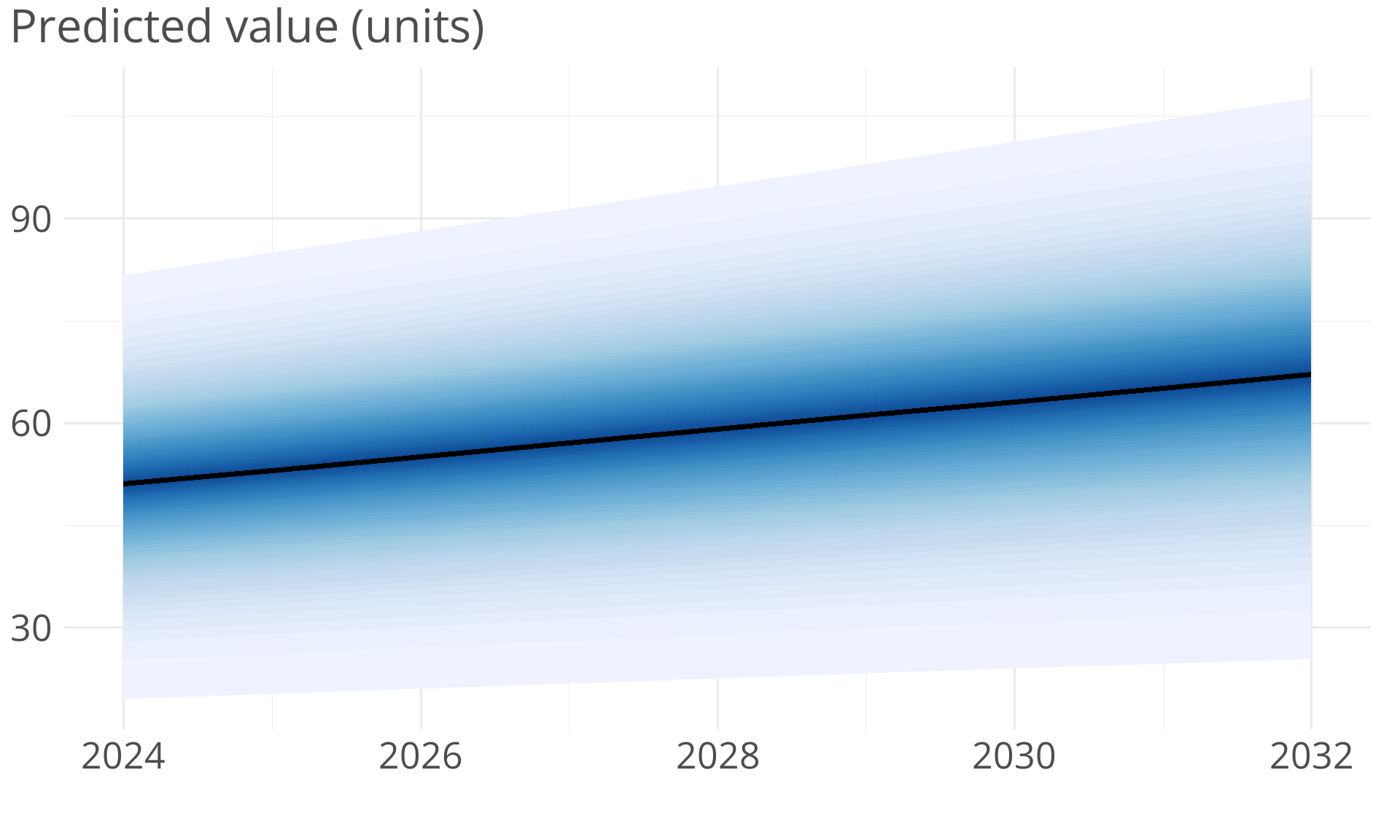
Caution: too many categories!
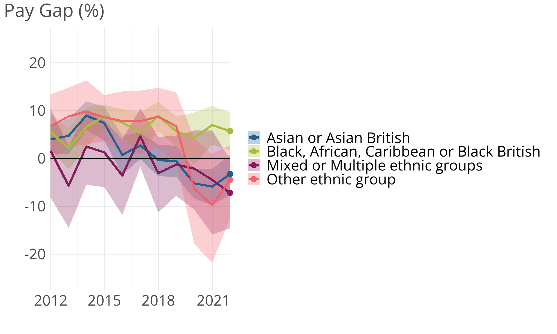
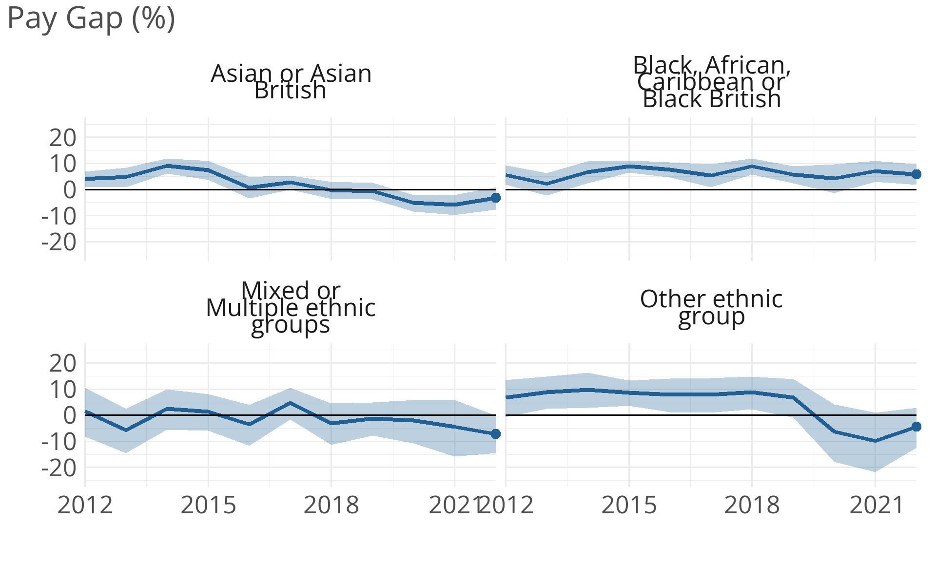
Consider small multiples instead
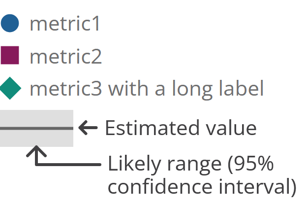
Legends

Legends
Showing distributions
Showing distributions of a single time point
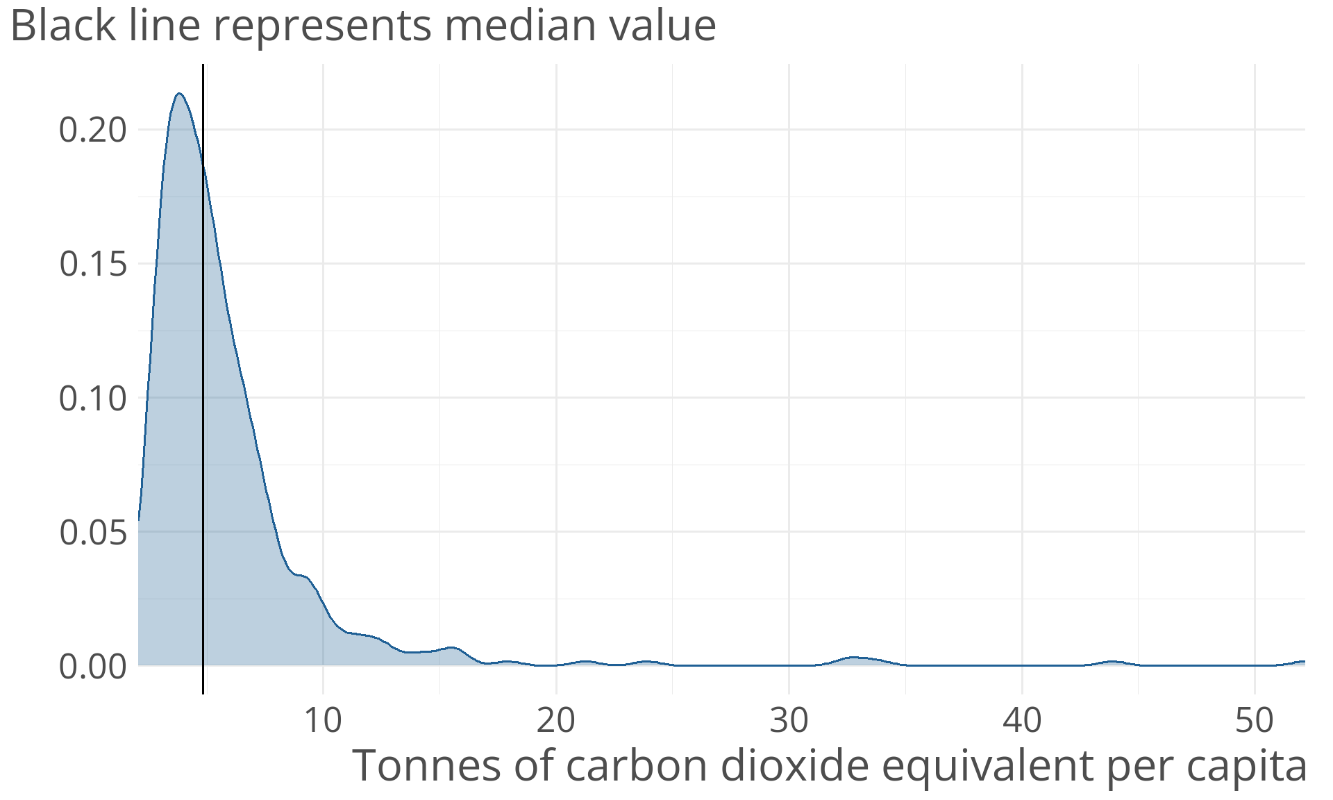
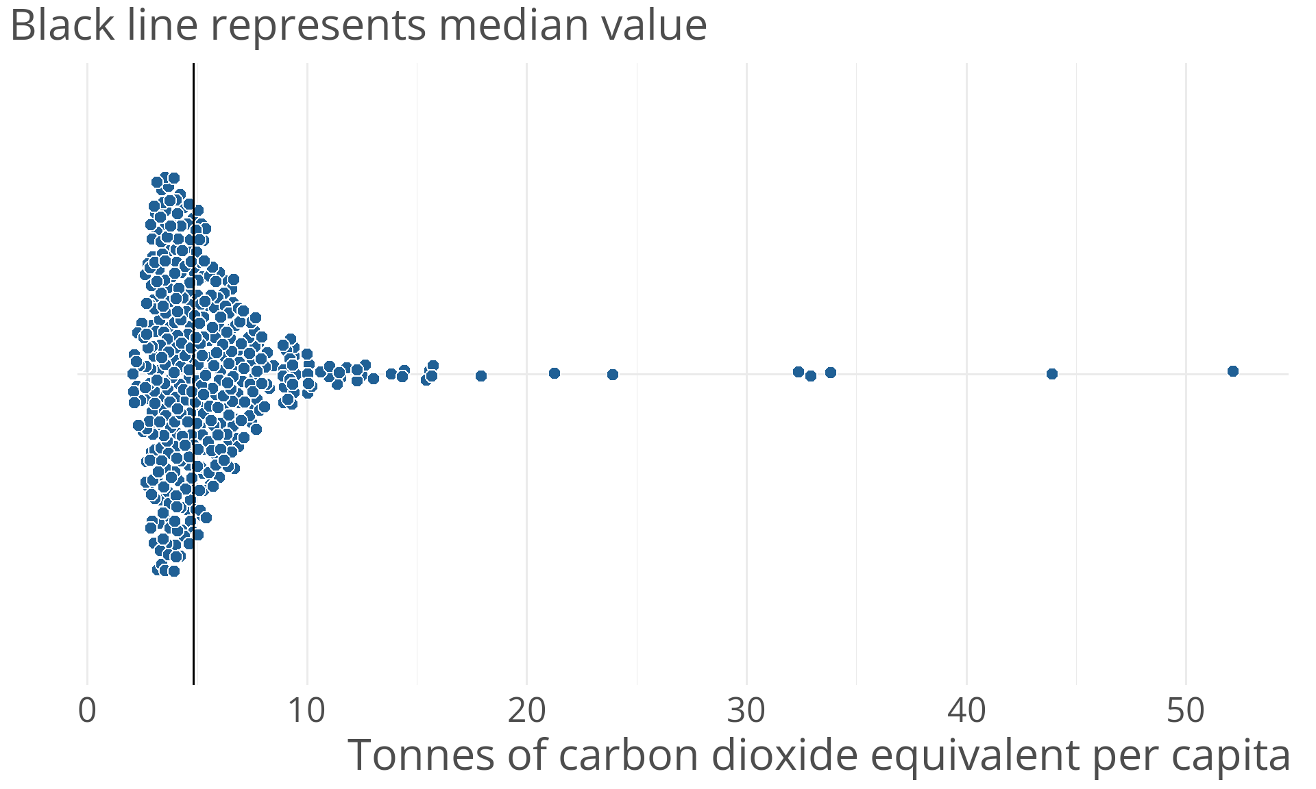
Better: Beeswarms
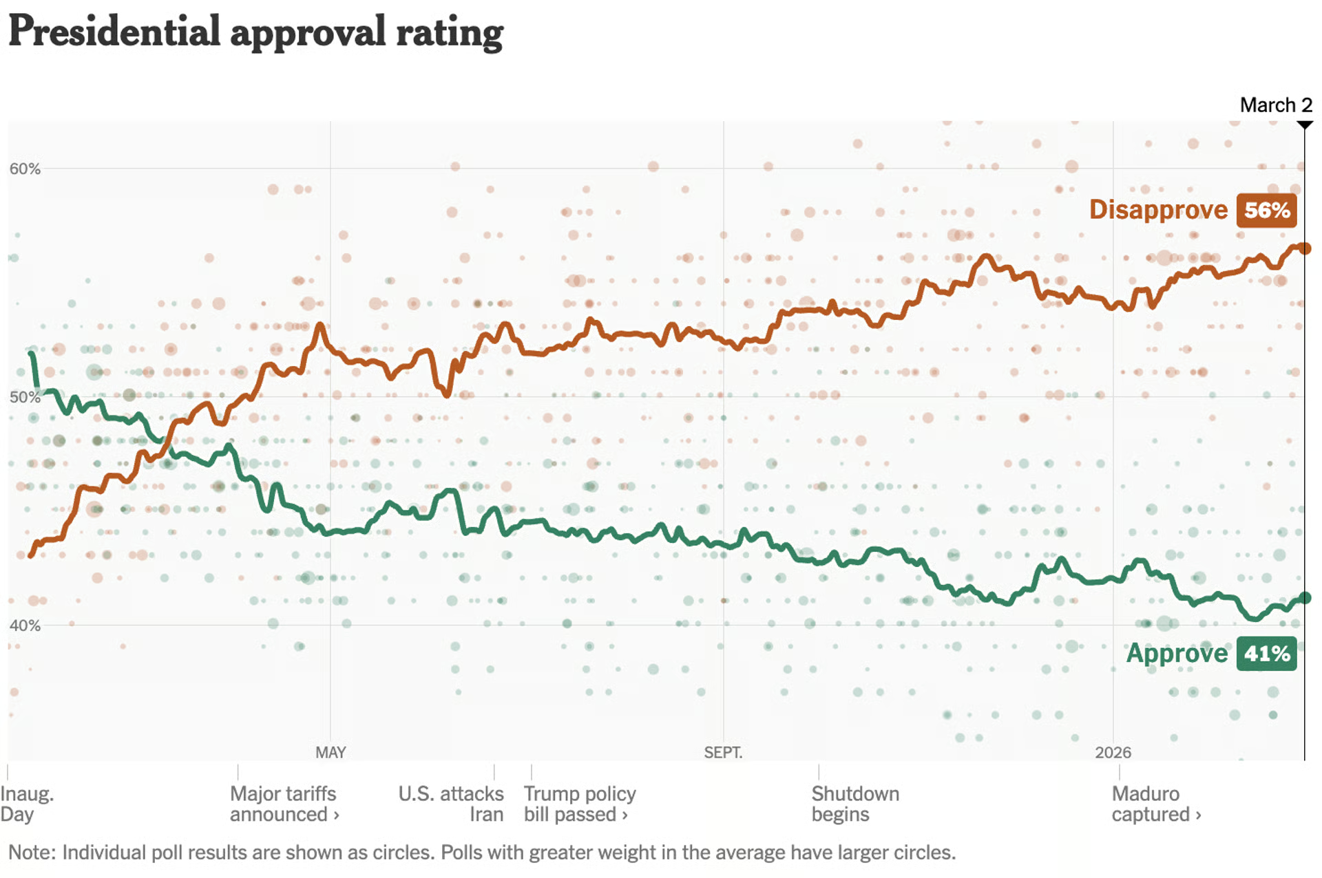
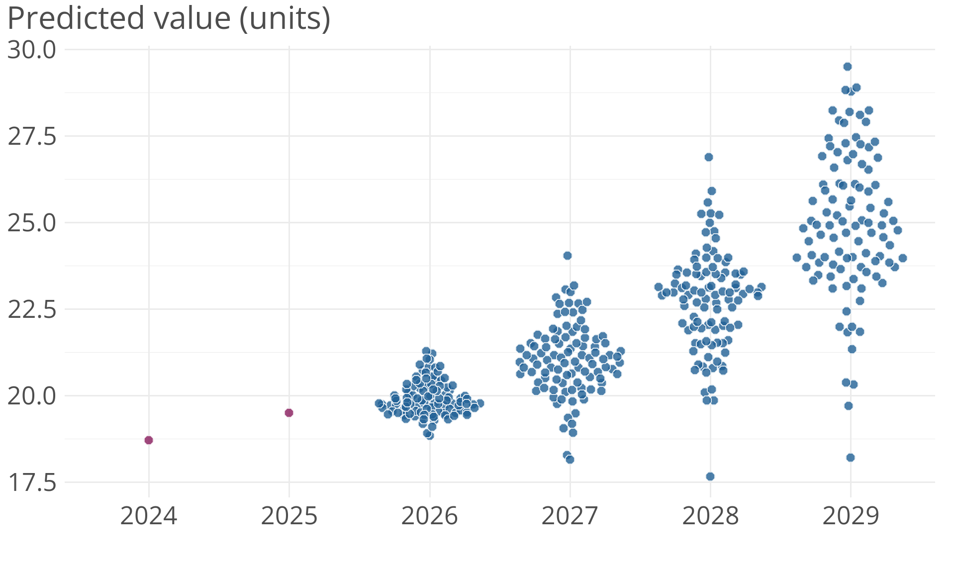
Distributions over time
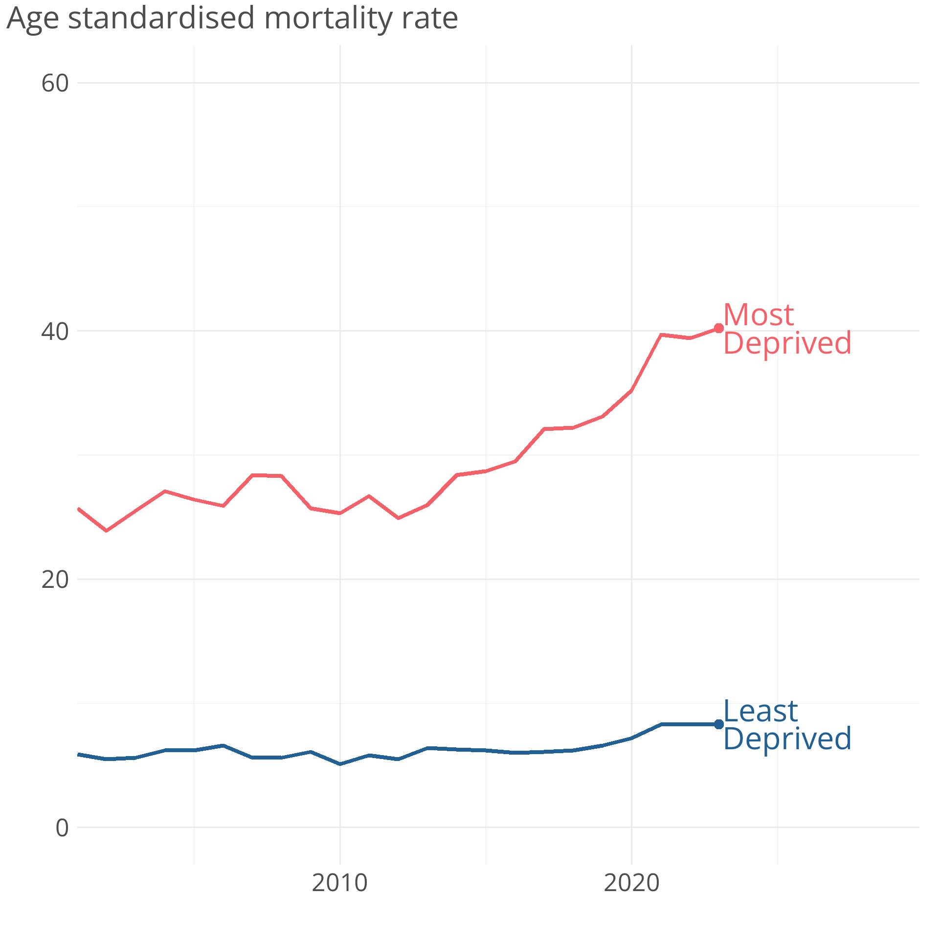
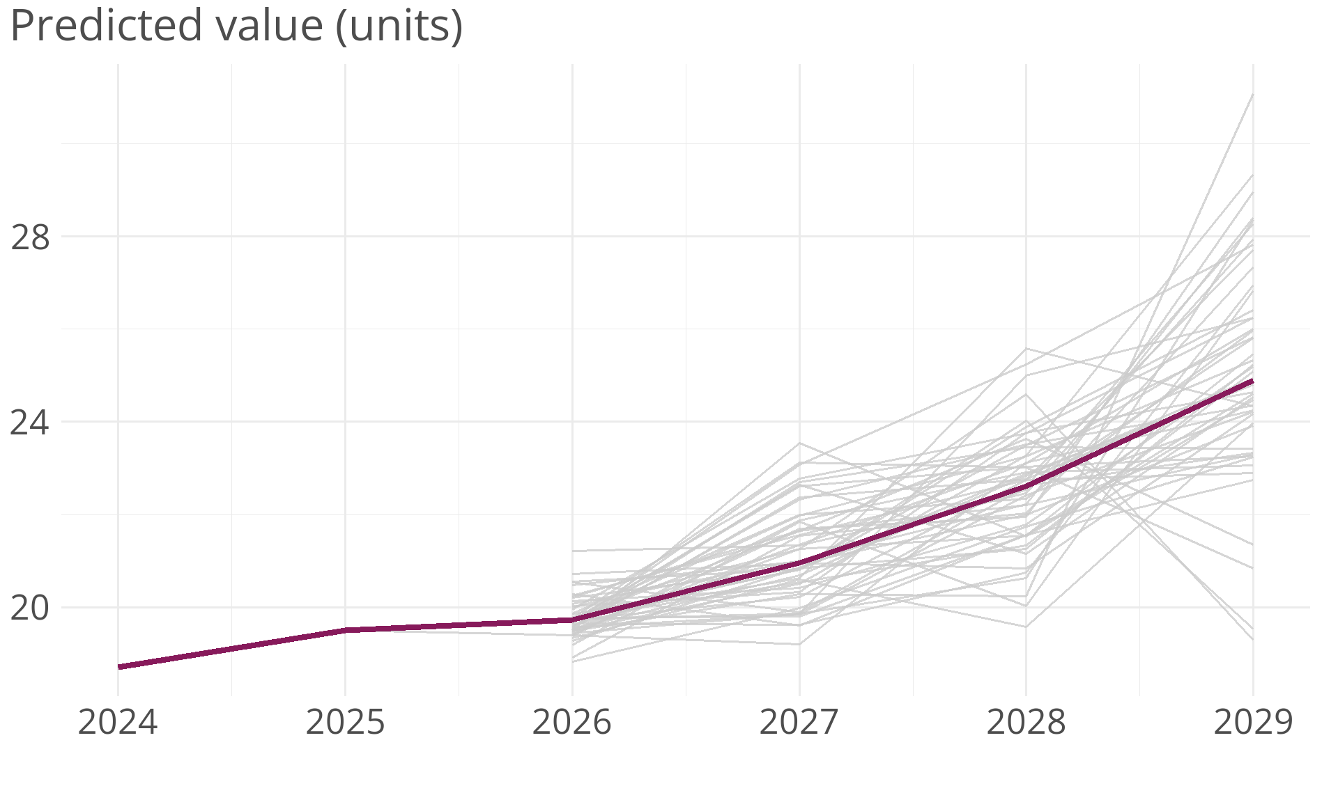
Trajectories over time
Exercise 2
Here are two charts. What is good and bad about each of them? How would you visualise this data?